1. Mindmaps
Trendmap 2007
Informationarchitects.jp presents the 200 most successful websites on the web, ordered by category, proximity, success, popularity and perspective in a mindmap. Apparently, web-sites are connected as they’ve never been before. Quite comprehnsive.
2. Displaying News
Newsmap is an application that visually reflects the constantly changing landscape of the Google News news aggregator. The size of data blocks is defined by their popularity at the moment.
Voyage is an RSS-feader which displays the latest news in the “gravity area”. News can be zoomed in and out. The navigation is possible with a timeline.
Digg BigSpy arranges popular stories at the top when people digg them. Bigger stories have more diggs.
Digg Stack: Digg stories arrange themselves as stack as users digg them. The more diggs a story gets, the larger is the stack.
3. Displaying Data
Amaztype, a typographic book search, collects the information from Amazon and presents it in the form of keyword you’ve provided. To get more information about a given book, simply click on it.
Similar idea is being used by Flickrtime. The tool uses Flickr API to present the uploaded images in real-time. The images form the clock which shows the current time.
Time Magazine uses visual hills (spikes) to emphasize the density of American population in its map.
CrazyEgg lets you explore the behavior of your visitors with a heat map. More popular sections, which are clicked more often, are highlighted as “warm” - in red color.
Hans Rosling TED Talk is a legendary talk of the Swedish professor Hans Rosling, in which he explains a new way of presenting statistical data. His Trendalyzer software (recently acquired by Google) turns complex global trends into lively animations, making decades of data pop. Asian countries, as colorful bubbles, float across the grid — toward better national health and wealth. Animated bell curves representing national income distribution squish and flatten. In Rosling’s hands, global trends — life expectancy, child mortality, poverty rates - become clear, intuitive and even playful.
Three Views shows three views of the earth, in which each country is represented by a circle that shows the amount of money spent on the military (size of circle) and what fraction of the country’s earnings that uses (colour). Compact and beautiful presentation of data.
We Feel Fine shows human feelings, calculated from a large number of weblogs.
Visualizing the Power Struggle in Wikipedia displays the most popular articles and the most frequent search queries in the heatmap.
Websites as graphs. An HTML DOM Visualizer Applet, which displays sites as graphs depending on the amount of links, tables, div tags, images, forms and other tags.
Interactive History Timeline presents the history of Great Britain, divided into interactive data blocks. The density of events is displayed on the map.
Winning Lotto Numbers is supposed to present the frequency of appearance of every number from one year to the next one. This graph is definitely not one of the most clear ones.
Elastic Lists demonstrates the “elastic list” principle for browsing multi-facetted data structures. You can click any number of list entries to query the database for a combination of the selected attributes. The approach visualizes relative proportions (weights) ofmetadata by size and visuzalizes characteristicness of a metadata weight by brightness. Author’s blog regularly informs about new experiments in the area of data visualization. Nice to observe, useful to bookmark.
The JFK Assassination TimelineAn Ajax-based approach vor visual presentation of historical events. John F. Kennedy assassination as timeline with numerous presentation options. The related article with further examples.
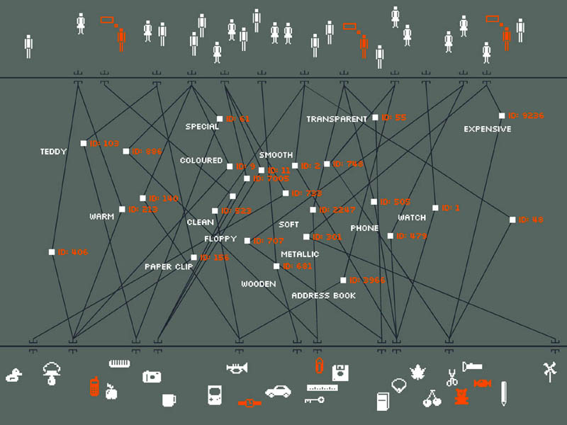
4. Displaying connections
Munterbund showcases the results of research graphical visualization of text similarities in essays in a book. “The challenge is to find forms of graphical and/or typographical representation of the essays that are both appealing and informative. We have attempted create a system which automatically generates graphics according to predefined rules.”
Burst Labs suggests similar or connected items to your search queries (favourite artists, tv shows, movies, genres etc.) in a bubble. Not really new, but still inspiring.
Universe DayLife displays events, connections and news as circles which gravitate around the topic they are related to. Musiclens gives music recommendations and presents your current mood and musical taste as a diagram.
Figd’t Visualizer allows you to play around with your network. You interface with the Visualizer through Flickr and LastFM tags, using any tag to create a Magnet. Once a Tag Magnet is created, members of the network will gravitate towards it if they have photos or music with that same Tag. Available for Mac OS X, Windows and Linux. Alpha-version.
What have I been listening to?: Lee Byron describes his approach of creating a histogram about his music listening history.
Shape Of Song: What does music look like? The Shape of Song is an attempt to answer this seemingly paradoxical question. The custom software in this work draws musical patterns in the form of translucent arches, allowing viewers to see - literally - the shape of any composition available on the Web.
Musicmap: connections are represented as connected lines; they create a web.
Musicovery displays music taste connections and lets you listen to the song and browse through similar songs.
Lanuage Poster proves that even simple lines can be descriptive enough. The History of Programming Languages as an original timeline.
5. Displaying Web-sites
Spacetime offers Google, Yahoo, Flickr, eBay and images in 3D. The tool displays all of your search results in an easy to view elegant 3D arrangement. Company promises that the days of mining through pages and pages of tiny thumbnails in an effort to find the item you are looking for are over.
UBrowser is an open source test mule that renders interactive web pages onto geometry using OpenGL® and an embedded instance of Gecko, the Mozilla rendering engine.
6. Articles & Resources
Visualcomplexity.com
The project presents the most beautiful methods of data visualization as well as further references and book suggestions. The gallery has over 450 entries. In his article Infosthetics: the beauty of data visualization Andrew Vande Moere, well-known through his blog Infosthetics, discusses the aesthetics of data visualization and modern apparoaches in this area. Creative design ideas combine form and content and generate fascinating graphs - is it a new area in the art of next generation? The article presents 13 new techniques of data visualization, with examples and further references.
16 Awesome Data Visualization Tools
“From navigating the Web in entirely new ways to seeing where in the world twitters are coming from, data visualization tools are changing the way we view content. We found the following 16 apps both visually stunning and delightfully useful.” An extensive overview by Mashable.com.
Dataesthetics
Eric Blue provides some references to unusual Data Visualization methods.
infosthetics - information aesthetics
Andrew Vande Moere about data visualization, latest development and design ideas.
Visualizing Delicious Roundup
An overview of Del.icio.us tools you can use to visualize your bookmarks.
Periodic Table
A periodic table of visualization methods.
7. Tools and Services
You can create your own timelines with Xtimeline and Circavie.
IBM Many EyesThis Java-based service visualizes data online and helps to create pie charts, diagrams, tree maps, bar charts and histograms. Registration is required. Some examples are simply amazing.
prefuse | the prefuse visualization toolkit
Presents the beta-version of a Java-based toolkit for programming of application with integrated data visualization methods
Swivel
This service creates pie charts, diagrams and histograms “on the fly”. It also provides a Swivel API you can use to improve already existing visualization methods.
You can find even more tools for designing your own diagrams and charts online in our article Charts and Diagrams Tools.
New-media Gurus
Amy Gahran - Contentious
Amy is an online-content and citizen-media guru, and self-described “provocateur.” Amy and I started the E-Media Tidbits blog (now published by the Poynter Institute) in 2000.
Ask Derek Scruggs
An Internet entrepreneur based in Boulder, Colorado, Derek is my former business partner on the Enthusiast Group. This is his blog.
BeatBlogging.org
A noble and smart effort to help reporters use social networks of niche experts to improve coverage of their beats.
BlogNetNews News Innovation
Aggregated feed of bloggers who cover new media and the general theme of news innovation.
Buzzmachine
Jeff Jarvis’ media/new-media blog. Jeff’s a prolific and influential blogger, former mainstream-media executive now a media consultant, and he often touches on citizen-media and social-networking topics.
Center for Citizen Media blog
Clear Content
Blog and website for online content and community consultant Joel Fugazzotto.
Dan’s Diner
Blog of online community/social media/new media guru Dan Pacheco.
Dan Gillmor’s blog
This is the citizen-media guru’s blog. Dan is director of the Center for Citizen Media, director of the Knight Center for Digital Media Entrepreneurship at Arizona State University, and a former San Jose Mercury News technology columnist.
David Berkowitz’s Marketing Blog
Interactive marketing insight and trends from marketer, columnist, speaker and strategist.
David Black’s Blog
Personal blog of the Group Director of Digital Publishing at Trinity Mirror plc. Includes links on the trends transforming newspaper and classified businesses online.
Editor on the Verge
Online musings from the newsroom and beyond, by Yoni Greenbaum.
eJour
Danish online journalism resource (in Danish!).
E-Media Tidbits
A group blog (20+ contributors) covering online news and new media, published by the Poynter Institute. Amy Gahran and I started this blog in 2000, then it moved to Poynter when I took a job there as a senior editor. I was Tidbits’ editor for 4 years; I continue to write for it periodically.
Eva Dominguez’ Bloggiculum
By new-media expert Eva Dominguez. (In Spanish; if you’re like me you’ll need a translation tool.)
Feld Thoughts
Brad Feld is a managing director at The Foundry Group and lives in Boulder, Colorado (and Homer, Alaska). His blog covers the Internet investment world and is a must-read for Internet entrepreneurs.
HowardOwens.com
Covering mostly newspapers online, by an online news pioneer.
Imagining the Future of Newspapers blog
Great group blog of news new-media thinkers by the Newspaper Association of America.
It’s the End of the Publishing World as We Know It, and I Feel Fine
B2B publishing executive Dan Blank on publishing, innovation and the Web.
Jack Lail: Random Mumblings
Media blog of Jack Lail, managing editor/multimedia for the Knoxville News-Sentinel.
Jay Small’s Blog
Part of his Small Initiatives consulting practice. Jay is an online news guru whose day job is with E.W. Scripps.
JD Lasica
JD is a star new-media blogger, founder of Socialmedia.biz, and co-founder of OurMedia.org.
Journalism Hope
K. Paul Mallasch’s thoughts and views on media in general and grassroots journalism (or independent media) in particular.
LocalJournalism.net
K. Paul Mallasch’s community where independent publishers can share ideas, information, stories, etc.
Local Onliner
Consultant Peter Krasilovsky’s take on what’s important and why, especially in the local search and media space.
Lost Remote
This is a great group blog (led by Cory Bergman) about new media, with special emphasis on the intersection of the Internet and broadcasting.
MartinStabe.com
A UK-centric blog covering online journalism and new media by journalist Martin Stabe.
Matthew Buckland’s blog
Matthew is a South African online-news pioneer and guru, and is general manager of the Mail & Guardian Online.
Micropersuasion
PR digital guru Steve Rubel on how technology is revolutionizing media and marketing.
New Media Bytes
Blog about changing face of news media online by Shawn Smith of MLive.com.
News After Newspapers
“An examination of the tools and techniques for journalism and news publishing that are rising as newspapers fall,” by Marti Langeveld.
Newspaper Death Watch
Newsroomnext
How to adapt the practice and business of journalism to the Web, by Michael Amedeo Tumolillo.
Notes From a Teacher
New media observations by Vancouver journalism instructor Mark Hamilton.
Online Journalism Blog
By Paul Bradshaw and “virtual interns.”
pda: the digital content blog
From The Guardian (UK). Reported by new media journalist Jemima Kiss.
Pressthink
NYU’s Jay Rosen on the transformation of media in the digital age. Consistently thoughtful.
Publishing 2.0
Scott Karp’s blog about how technology is transforming media.
Recovering Journalist
Mark Potts is a consultant and entrepreneur. These are his thoughts on the media, the Internet, Web 2.0 and changes in how we create, receive and interact with news, information and advertising.
Reflections of a Newsosaur
Alan Mutter covers the business side of the newspaper industry and its digital transition.
Romenesko
If you’re in the news business and you don’t read Jim Romenesko’s blog on Poynter Online … well, what’s wrong with you?
Ryan Sholin: Invisible Inkling
New media vision and ideas by Ryan Sholin.
Tell Zell
Anonymous blog by a LA Times staffer documenting and commenting on how Tribune Co. owner Sam Zell is steering the company into the ground.
